

PDF, 6 pages, A4 (opens in new tab)
Self-initiated / Type Design
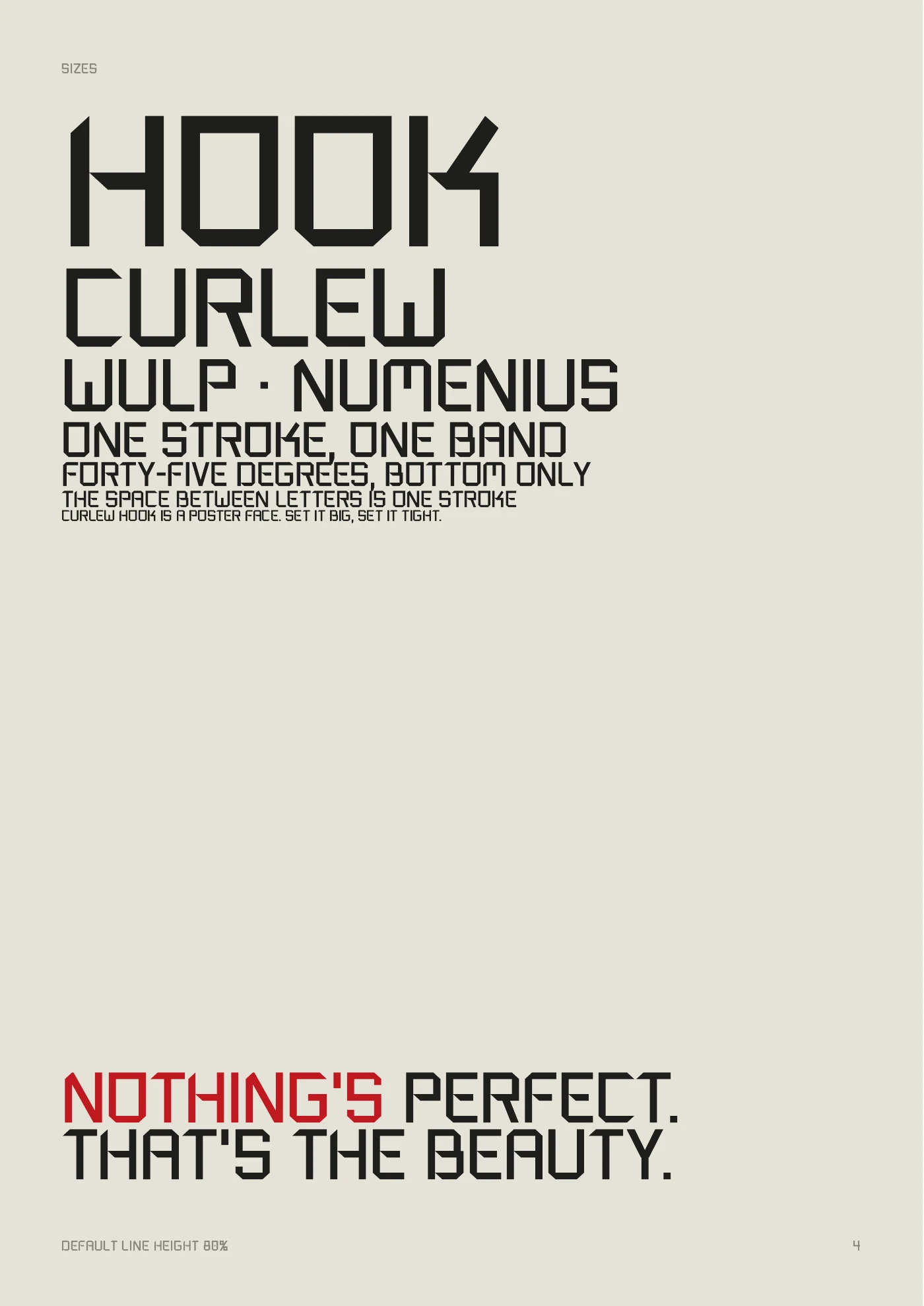
A poster typeface built from one rule: a single stroke, cut at 45°. Loosely after Kho Liang Ie and Wim Crouwel.
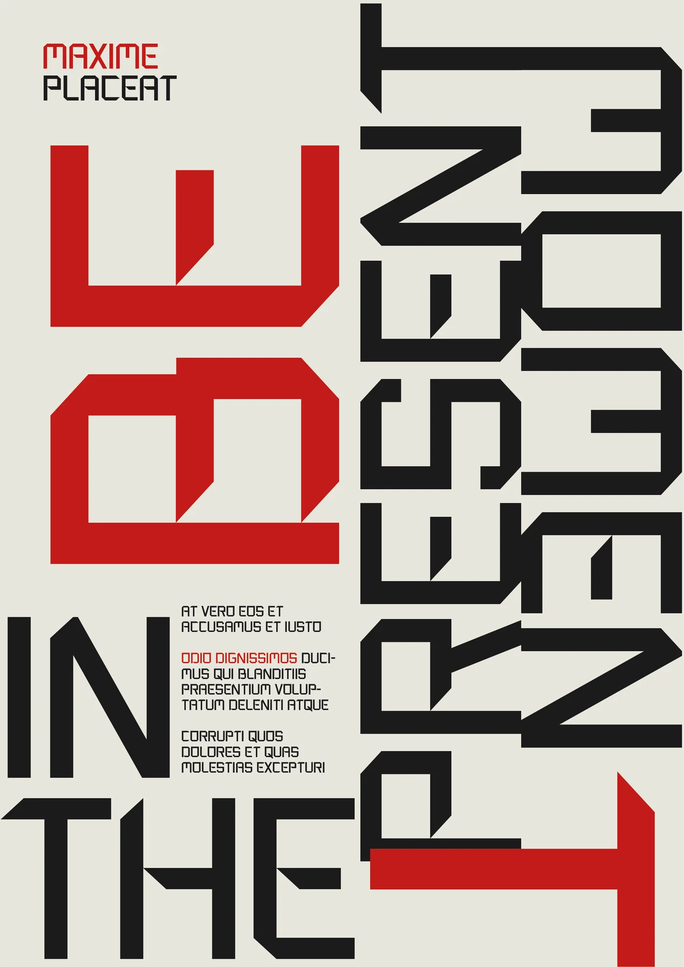
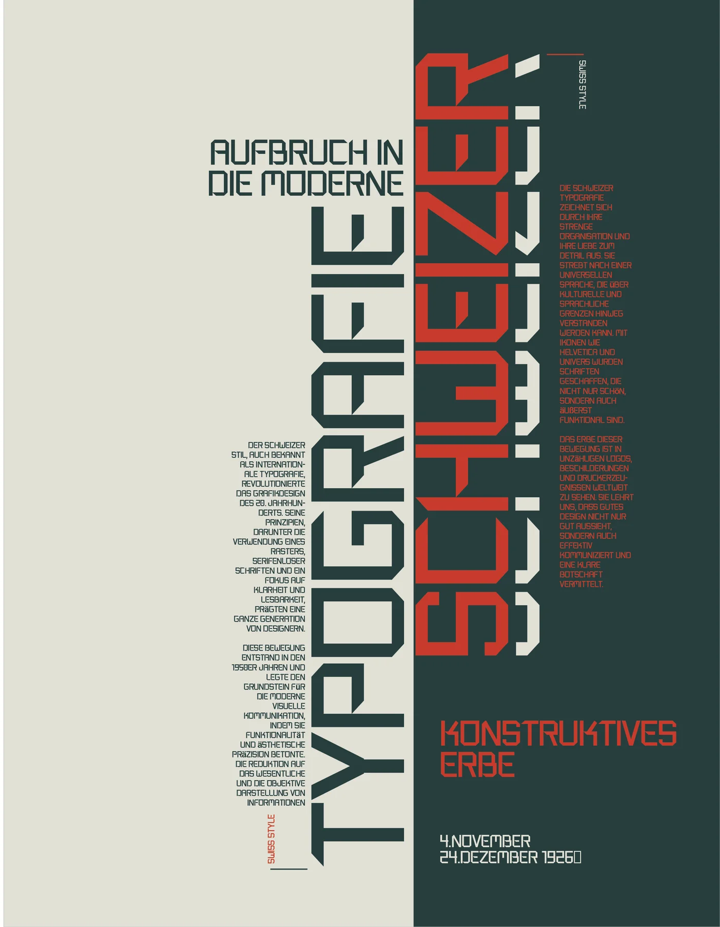

I wanted to know what it takes to make a typeface, not just use one. So I gave myself a brief: a poster face that sounds like me.
The starting point was a poster in the Stedelijk Museum collection: Kho Liang Ie (attributed), poster with a design for a typeface, early 1970s. Square, stencilled, a little stubborn. I wanted to make it more square and lean it toward my own logo.
My logo has its own roots in Wim Crouwel’s New Alphabet (1967). So the typeface became a bridge: from Kho’s poster to the source of my own mark.


The name. Curlew Hook is a perfect anagram of Crouwel + Kho (C-R-O-U-W-E-L-K-H-O). The curlew (wulp) is a bird I see on my birding walks; the hook describes the chamfered letterforms. The runner-up was Halo King, an anagram of Kho Liang.
The credit line, built into the font itself: Loosely after Kho Liang Ie and Wim Crouwel’s New Alphabet.
Every letter follows the same handful of rules. Crouwel kept a strict grid; I gave myself more leeway, but the rules had to hold.

Nineteen versions. Every version was kept, with the options I said no to.
Kho’s stencil gaps were the first thing I changed. First the tops closed, with a 45° cut where the bowl turns. Then, in another round of minimalism, the last gap became a 45° notch where the crossbar meets the stem. A fully closed version made D read as O and B as 8, so that one stayed out.
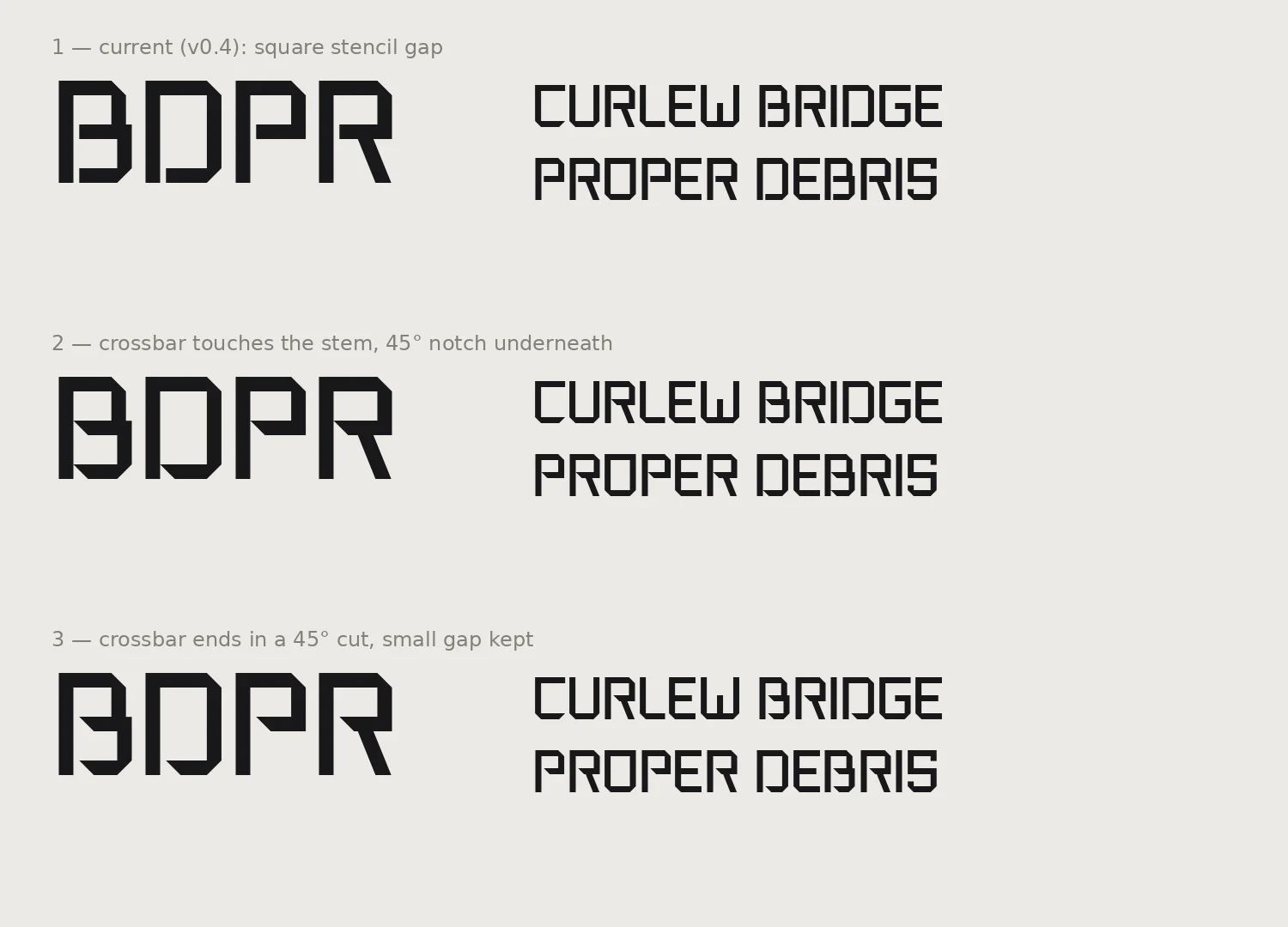
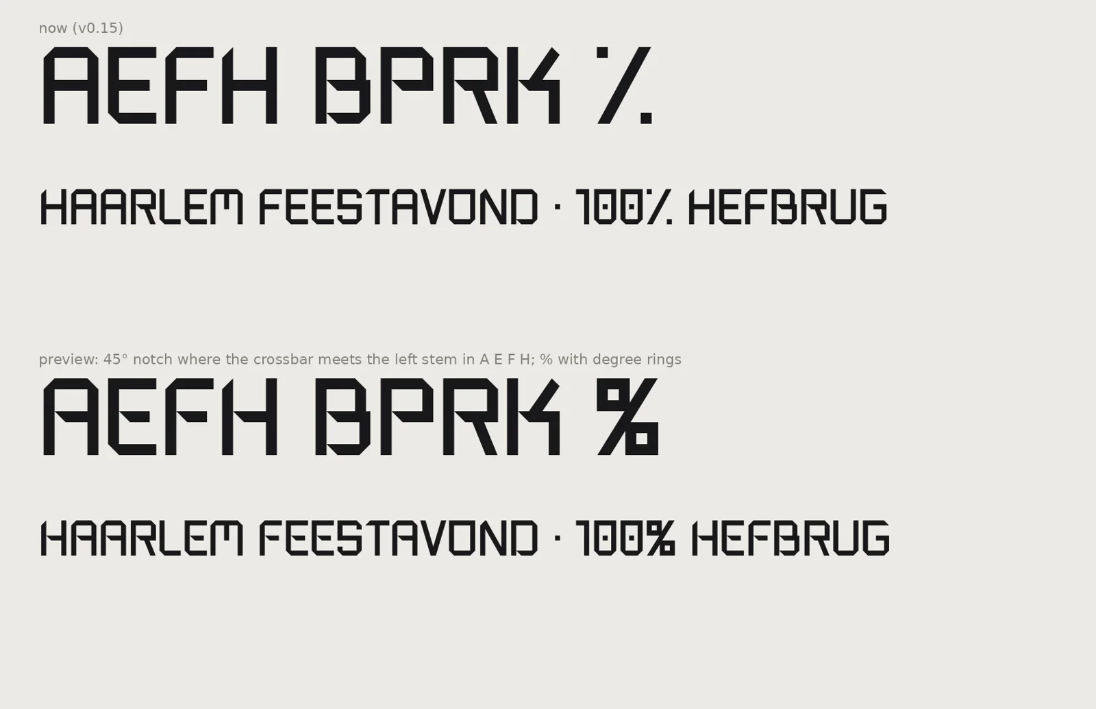
Later A, E, F and H got the same notch. That small cut is the one detail that is neither Kho nor Crouwel. It’s mine.
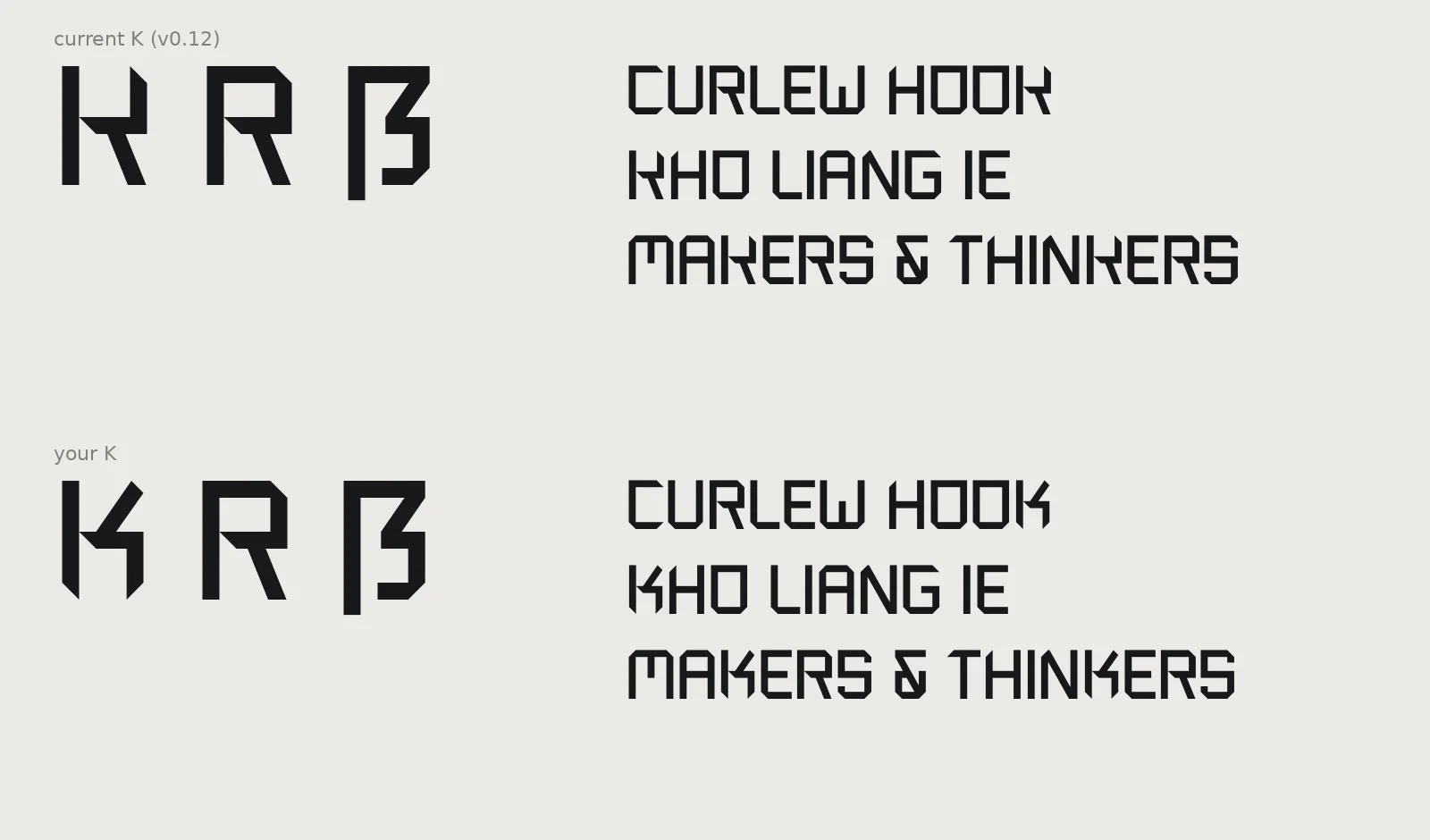
Three rounds. The final K I drew myself in Illustrator, borrowing the angle of the ẞ. I chose square feet over chamfered ones: I was trying to make it too fancy.
The ampersand is also my own drawing, imported into the font as it was.
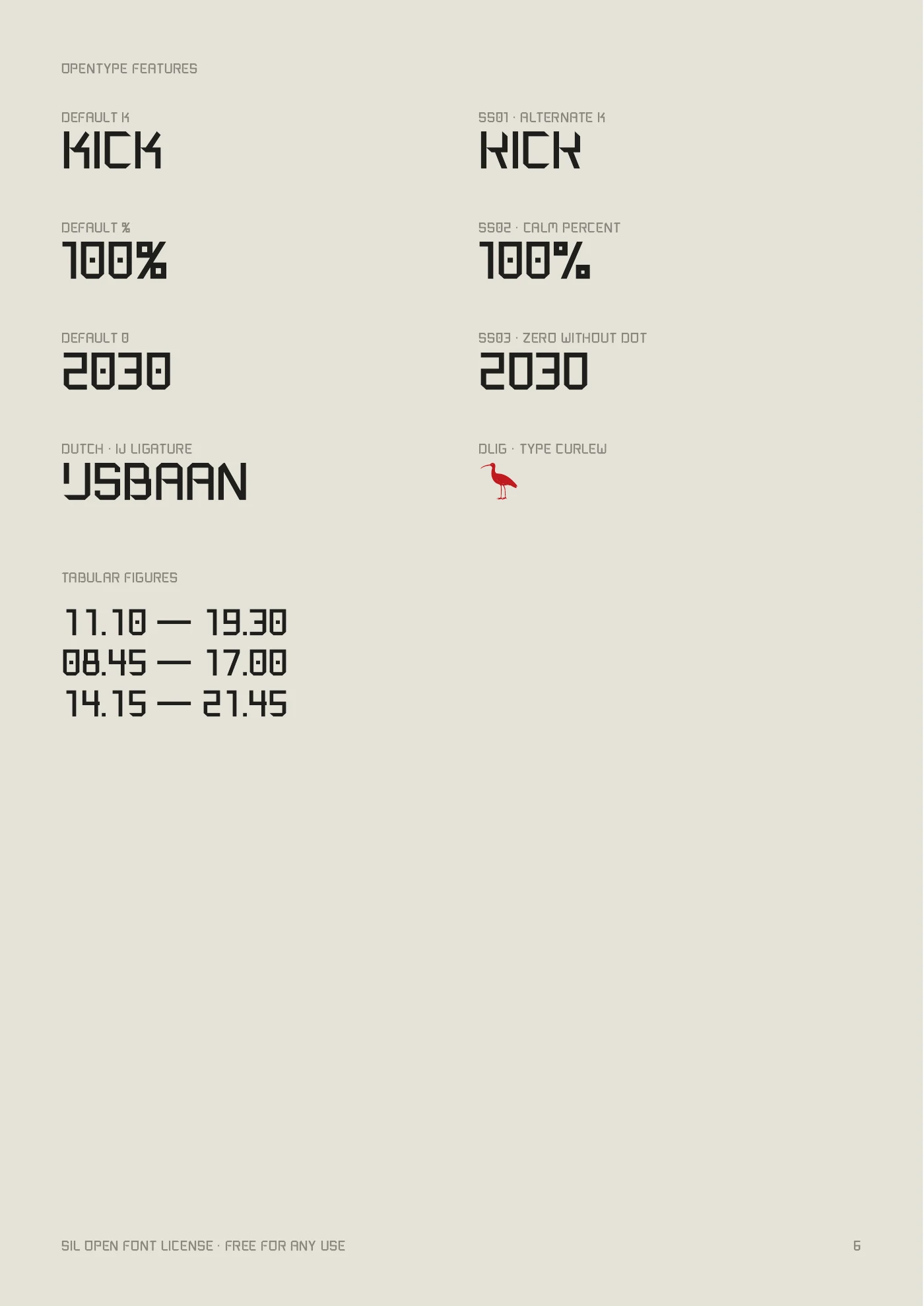
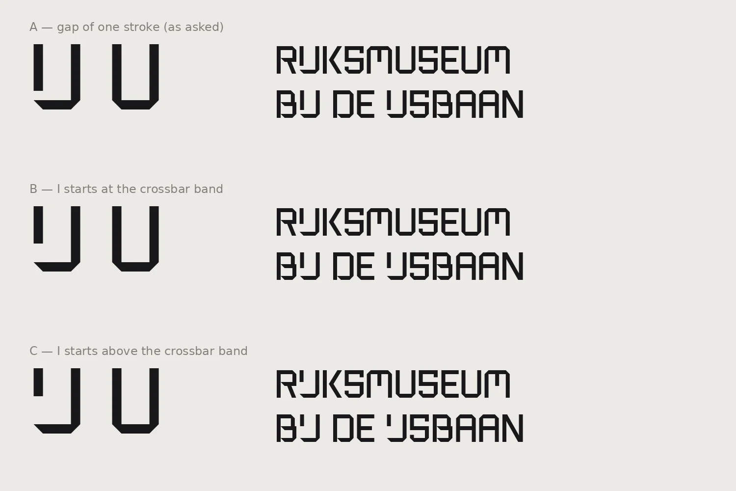
I love the IJ in the Rijksmuseum logo. Curlew Hook has a full-width J with the I hovering above it, starting at the crossbar band. In Dutch text it appears automatically.
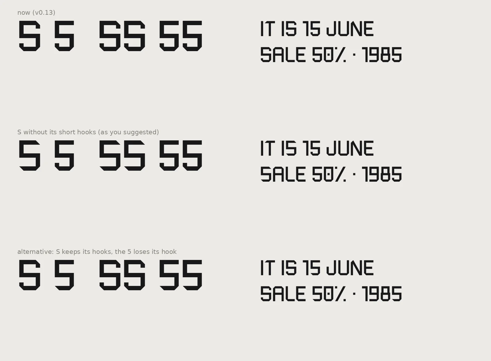
My first test posters showed “IS” reading as “15”. The 5 lost its hook; the S stayed. Dots in every numeral and an S with every corner cut were tried and rejected.
Nothing was wasted. Rejected options now live in the font as stylistic sets: the earlier K, a calmer percent sign, a zero without its dot.
| Version | What changed |
|---|---|
| v0.1–v0.2 | First alphabet, then the spacing system built from the stroke |
| v0.3 | B, D, P, R closed at the top |
| v0.4 | All crossbars into one band |
| v0.5 | Stencil gaps replaced by a 45° notch |
| v0.6 | Dutch IJ ligature; zero gets a square dot |
| v0.7 | First K redesign |
| v0.8–v0.9 | My own ampersand |
| v0.10 | Full punctuation; the Dot style; extra corners letter by letter |
| v0.11–v0.12 | Western European accents and a capital ẞ |
| v0.13 | My own K |
| v0.14 | S and 5 separated |
| v0.15 | Arrows at 45°, and a curlew hidden in the font |
| v0.16 | Notch on A, E, F, H; optical correction |
| v0.17 | Tabular figures and stylistic sets |
| v0.18 | Group kerning for T, F and P |
| v0.19 | Central and Eastern European accents; language rules |
The hardest calls were the ones where the obvious fix made the font worse.
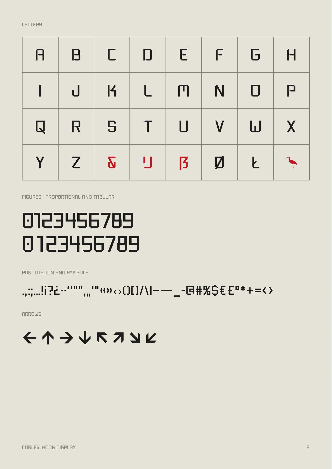
An alphabet is 26 letters. A typeface is everything around them. This is the part nobody sees, and the part I enjoyed most.
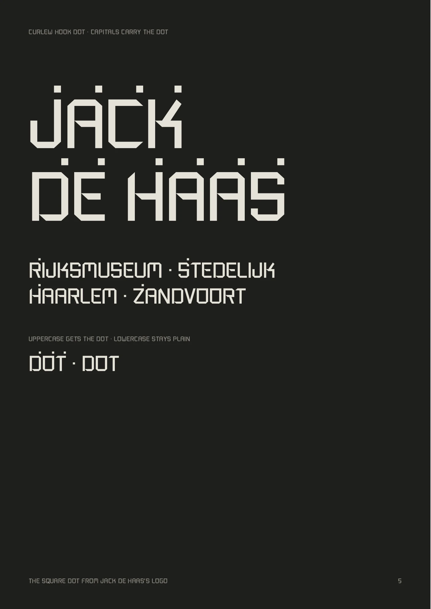
When you type Ä, your keyboard sends one code for “A with umlaut”, not an A plus two dots. If a font has no Ä, your software quietly swaps in another font. My first test posters showed exactly that. Curlew Hook now builds about 90 accented capitals from a small set of marks, all in the same language: square dots, 45° strokes, one stroke thick.
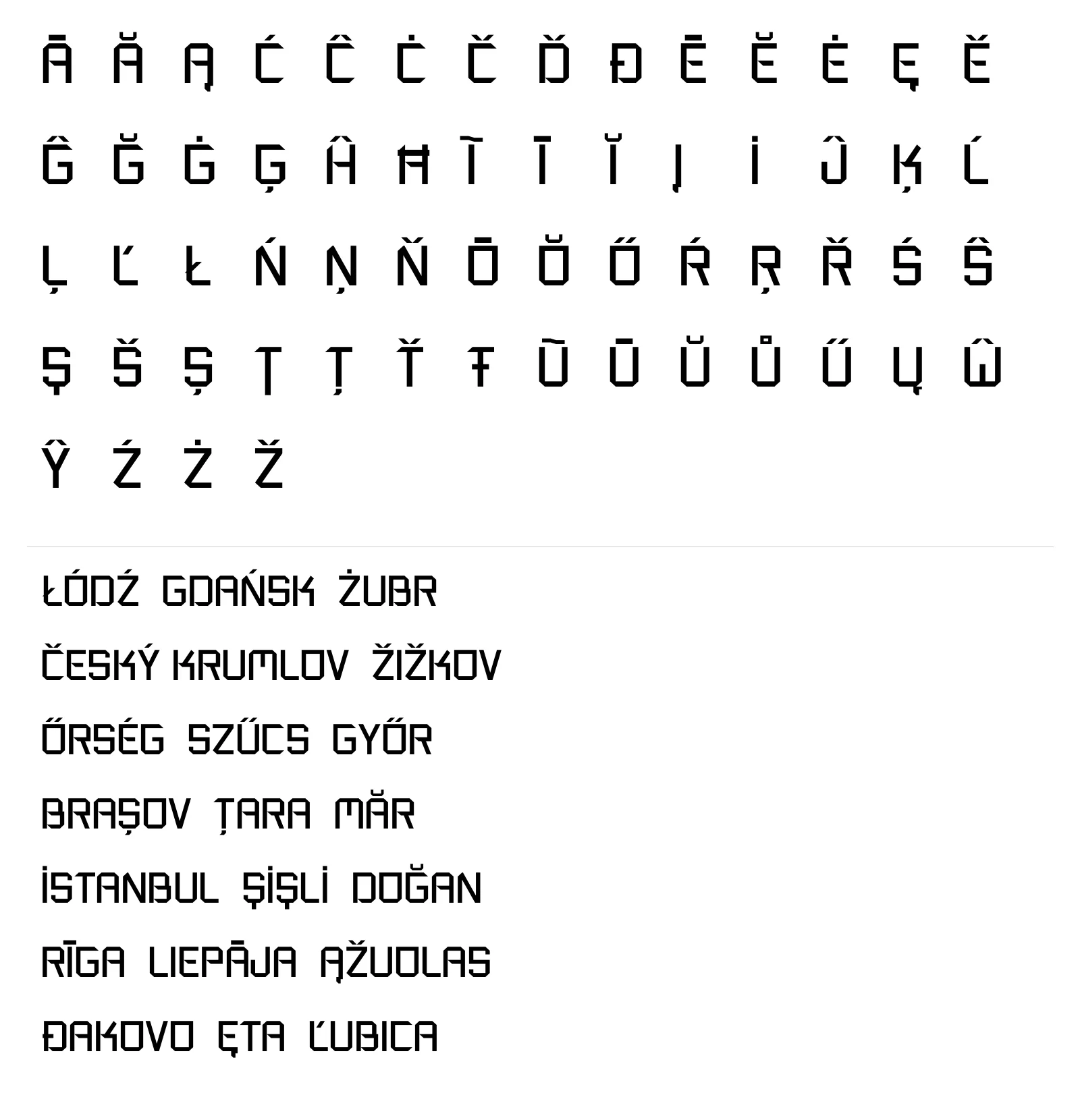
The Dot style gives capitals the square dot from my logo. But the dot above (İ, Ż, Ė) is the same square. In Dot, a plain I looked like İ, which is wrong in Turkish. The fix: language rules inside the font. Set your text to Turkish, Polish, Lithuanian or Maltese and the clashing dots disappear automatically. Everywhere else they stay.

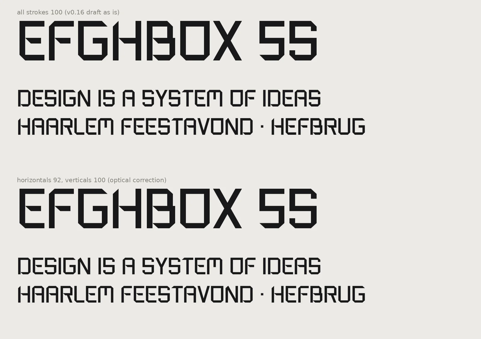
Horizontal strokes are 92 units, vertical ones 100. Your eye sees horizontals as heavier, so they are made slightly thinner to look equal.
Normally a 1 is narrower than an 8. For timetables and price lists, a switch makes every digit the same width so columns line up.
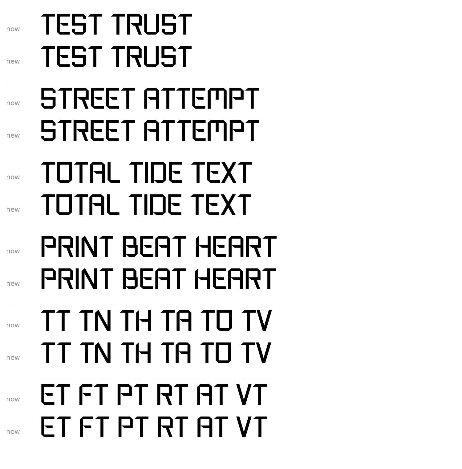
The T, F and P are spaced in groups: they move away from letters with a flat top and tuck in next to cut corners and rounder shapes. 58 pairs nobody will notice, and every poster looks calmer for it. The details are the details.
I ran the font through WhatTheFont. It found 93 “similar” fonts in the MyFonts library; none share the system.
Curlew Hook comes in two styles, Display and Dot, with about 190 characters each: capitals, numerals, full punctuation, arrows, accents for most European languages, and a curlew hidden inside (type CURLEW with discretionary ligatures on).
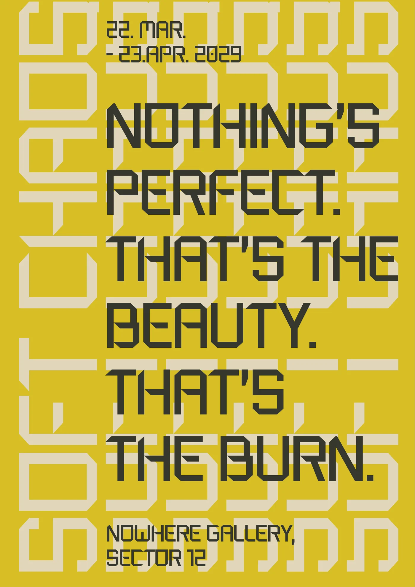
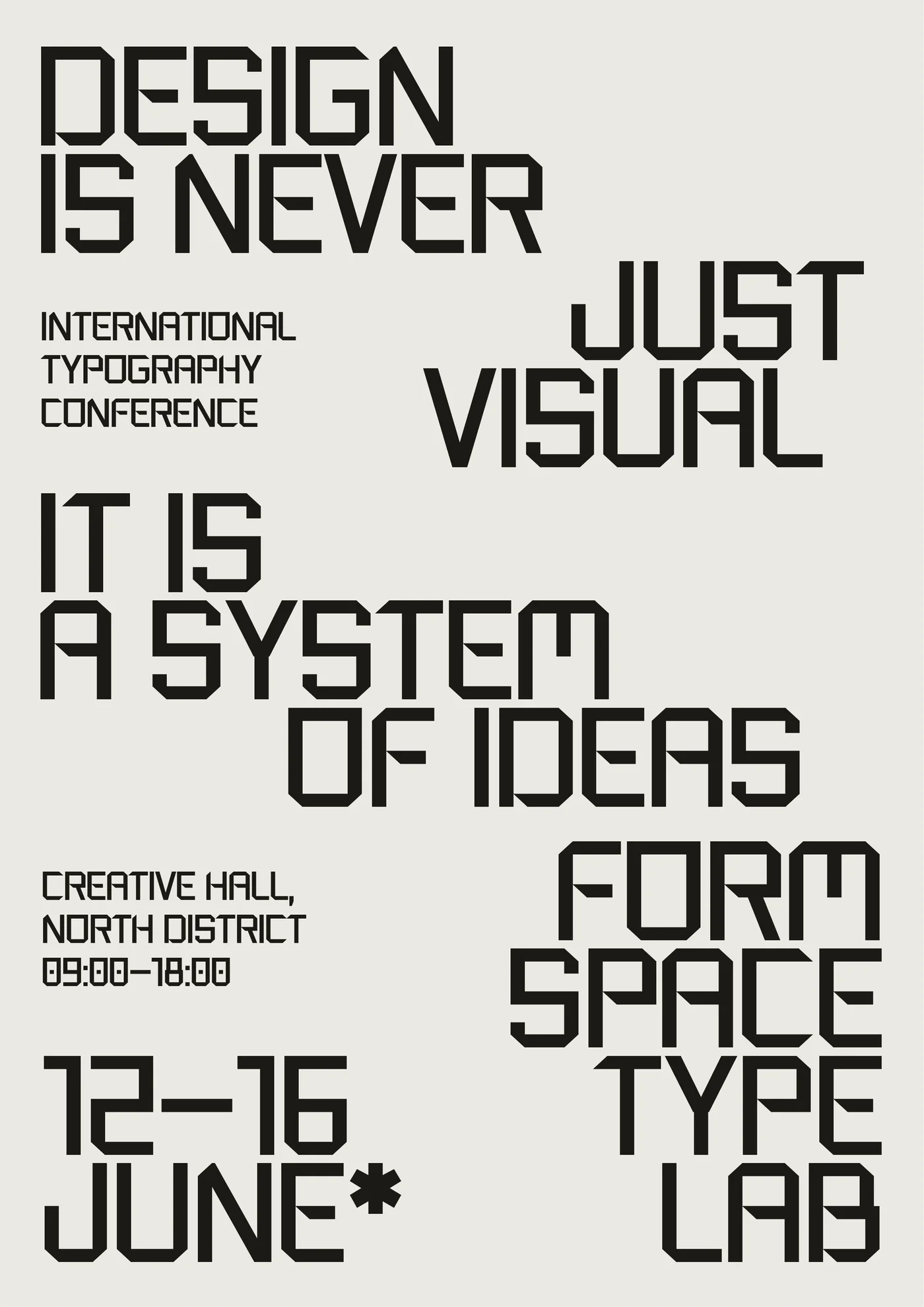
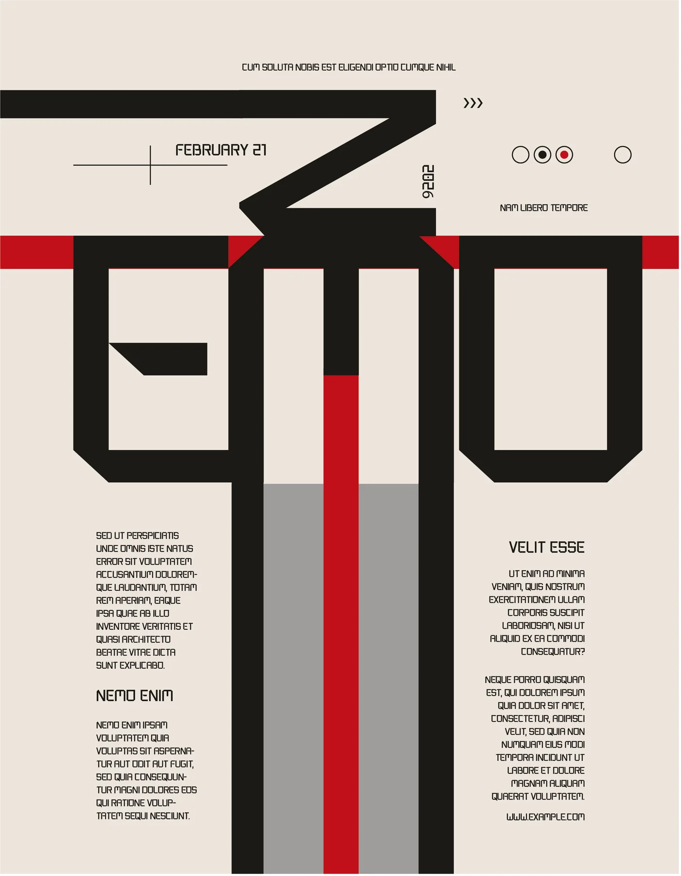
It now sets the headlines on this site, paired with Klein Text for body copy. And it holds up on posters: eight test layouts, from a Swiss grid to letters used as architecture.

Curlew Hook is released under the SIL Open Font License: use it for anything, including commercial work. Made something with it? I’d love to see it.
Download Curlew HookZIP, 57 KB — both styles (OTF), type specimen, readme and license. Version 0.19.